Here’s how to manage and deal with color in print: Read the first in a series of articles by Nancy Sharon Collins in PRINT magazine about how we perceive colors on a printed page.
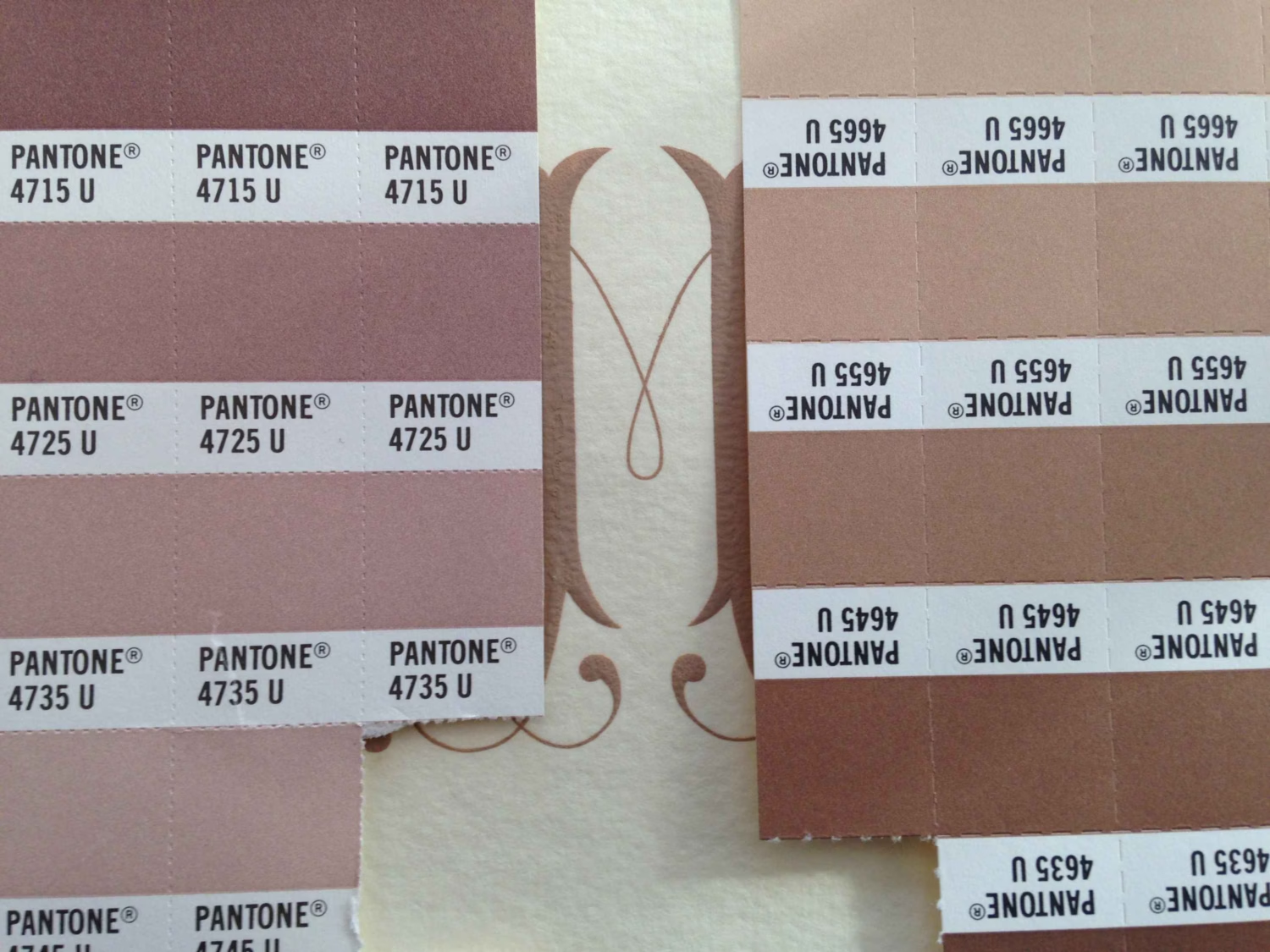
Did you ever wonder about the ink colors used in engraved stationery? When you want to match the drapes with your new monogram, how does this happen? In this series, Mrs. Collins explains how engraving print makers, and printers in general, match ink colors to client’s ideas. In this first article, Mrs. Collins goes into the origins of color matching systems, explains a bit about how designers choose colors with and for their clients, and discusses some challenges printers and designers face using color today.
Quoted in this article are influential design educators and gurus such as Jessica Helfand and Ellen Lupton. Helfand is a founding editor of Design Observer and 20+ year design educator at Yale University. Lupton is curator of contemporary design at Cooper-Hewitt, National Design Museum and director of the Graphic Design MFA program at Maryland Institute College of Art—MICA. Mrs. Collins also draws from color and design authorities such as Ted Owen, V.P. Package Design, Clinique Laboratories and in upcoming articles, professionals from Pantone, Konica Minolta, Moo.com, and Rochester Institute of Technology.