This Case Study falls into the Special Projects category as Mrs. Collins rarely accepts commercial projects. This exception, commissioned by a principle in a family business, struck her fancy. The company has an intriguing history which Mrs. Collins thoroughly enjoyed learning about.
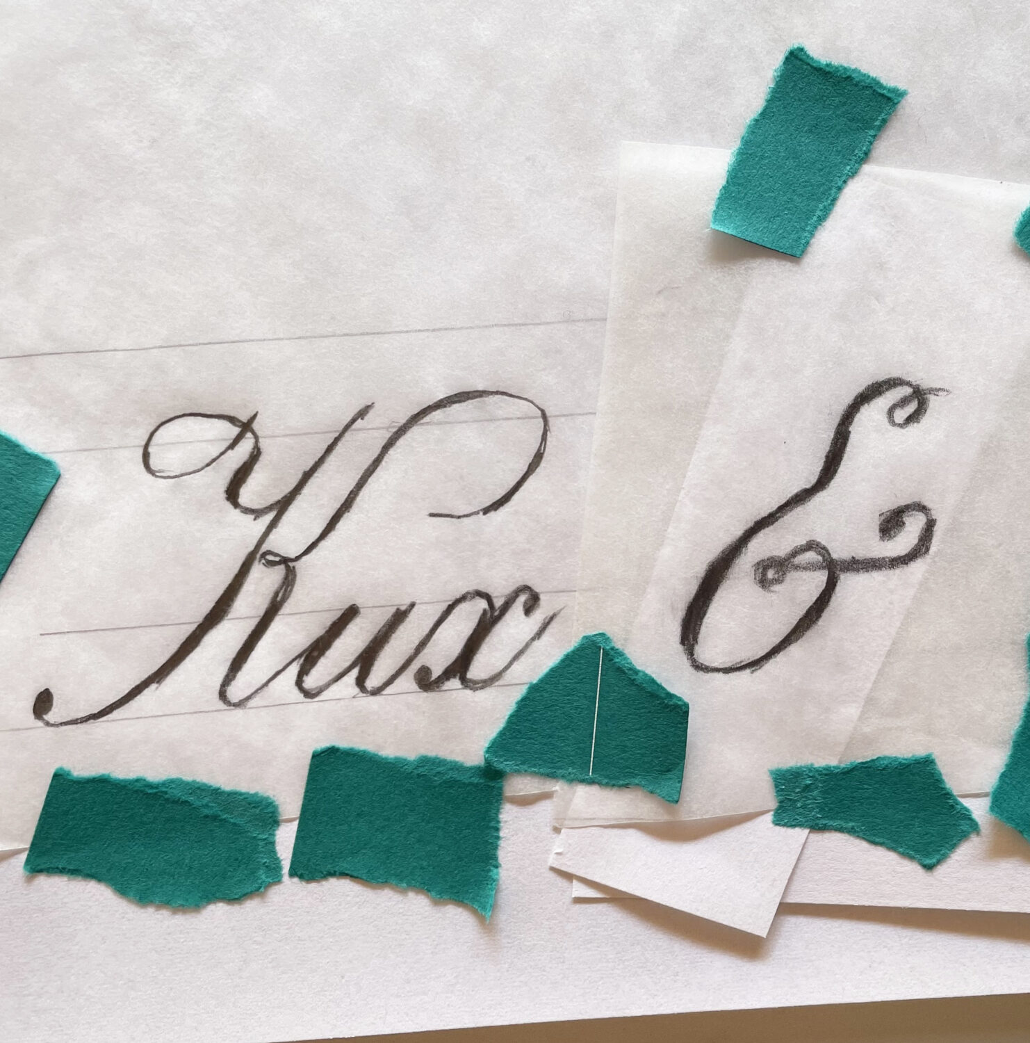
With the help of the family member, Mrs. Collins was able to construct a “feel” for the kind of lettering she would then hand-draw. This is one of the sketches for that project. You can see that several layers of modifications build the final lettering. The little green bits are adhesive tape. Mrs. Collins draws then re-draws, then re-draws again the various letters. Adjusting each so that it fits and compliments its neighbor. Such as the alignment of the ampersand to the “x” to its left.
Though not calligraphy—calligraphy is performed with a pen or brush and Mrs. Collins uses a graphite pencil—this particular study is based on calligraphy from the very early 20th century.
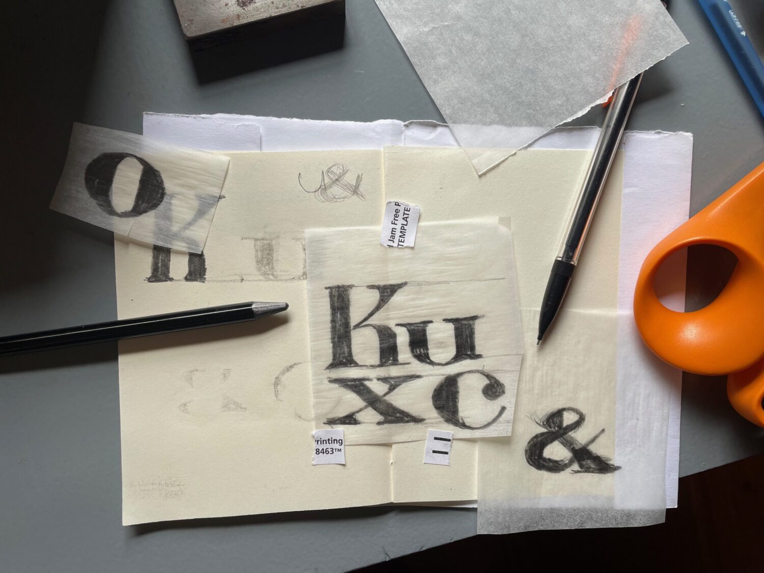
Other studies were based on block and letterpress forms used at the time of the company’s founder. Here are a few.