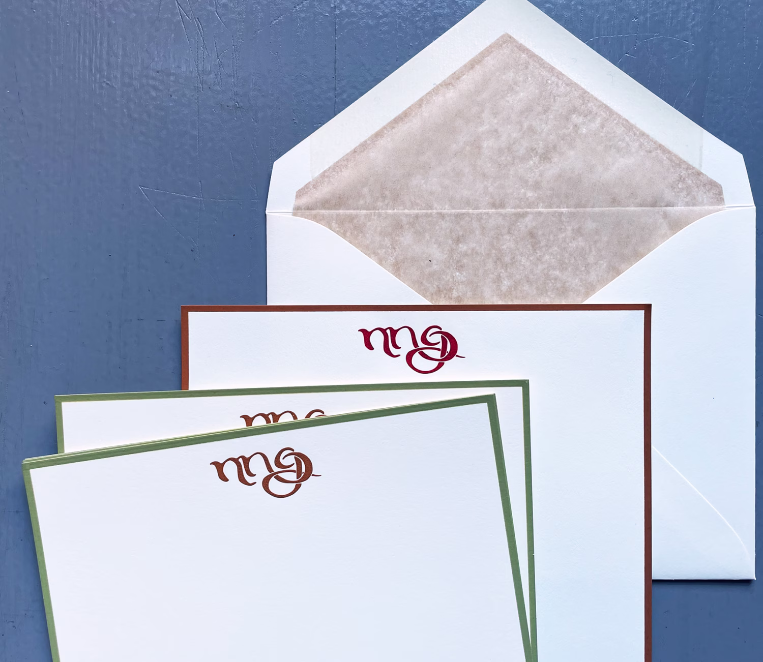
This subtle suite of bespoke, engraved stationery was recently finished and delivered to the delighted couple with their new baby in a very big city.
It would be an overstatement to say that this collection is spectacular when, in fact, the color details ar so subtle it is divine.
Notice, please, that the hand-drawn, and engraved, monogram on the bottom with the green borders is a different color that on top. Which is a kind of burgundy which, on the letter sheets, matches the borders.
Conversely, on the note sheets (bottom) the monogram is a saddle-color which is the feature image in the directory.
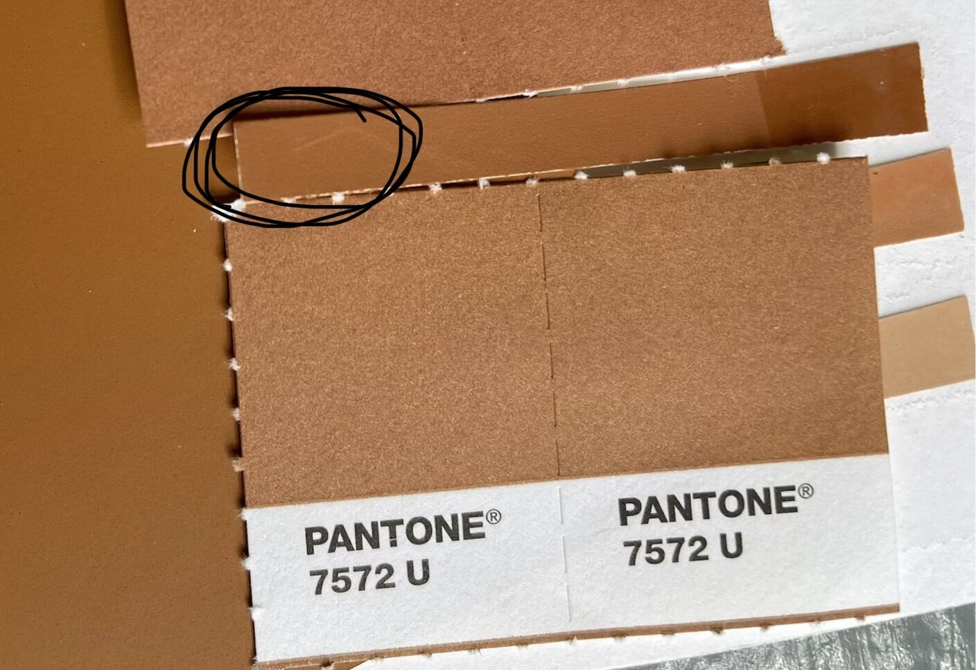
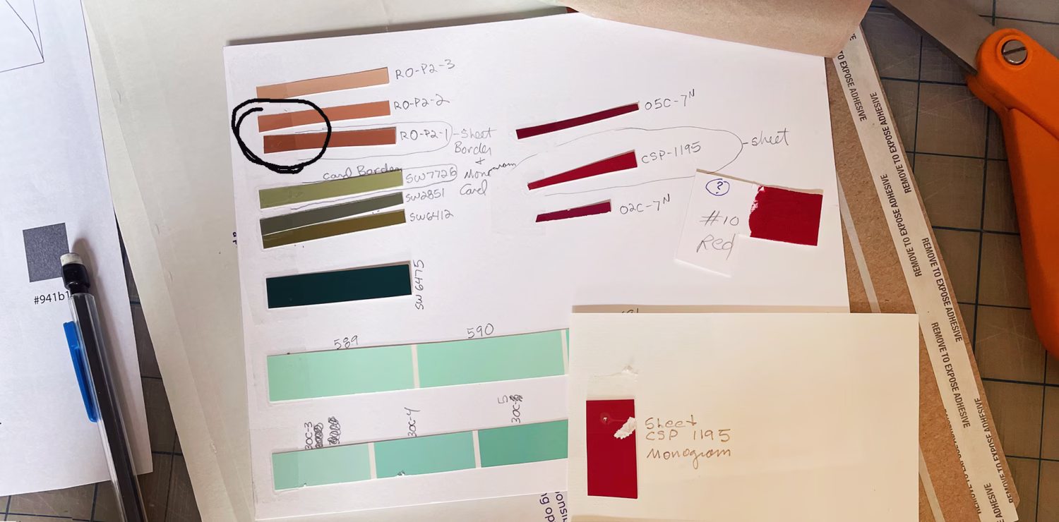
All of our ink colors are mixed by hand and to eye. An arduous method, yes, with the aim to achieve the colors our clients ideally want. NOTE: Unfortunately, some colors are simply not achievable, which is very sad. Why? Pigments are no longer available in some hues. There is a good reason for this, which is, some pigments can only be made from toxic mineral which were once used and, thankfully, are no longer.
In this suite, we were able to source all components necessary for perfect harmony.
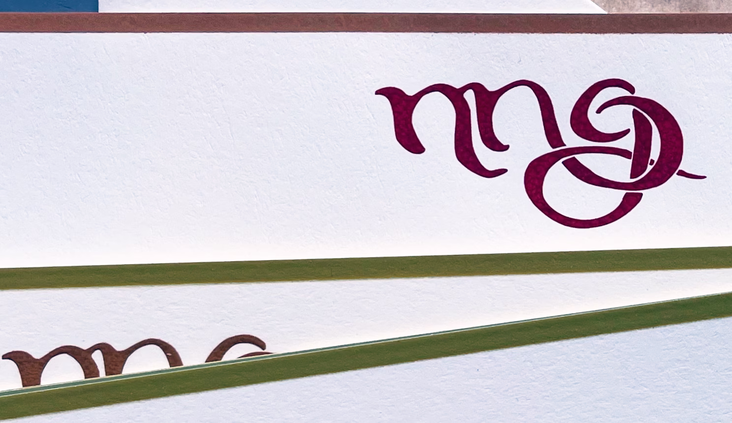
Notice that the bottom piece of the monogram, sandwiched between the sage bordering, is a different ink color than the top which is burgundy. The bottom piece is the saddle as sampled for the feature image in the blog directory. Here it is again.
In addition to expert handling of colors, we endeavor to communicate what is and is not commercially possible. Mrs. Collins loves talking about color, and how it is achieved, contact her directly to chat about a bespoke engraved suite in your own custom colors.
Contact Collins directly, HERE.