Published in PRINT Magazine earlier this month…the story of Sackers typefaces from Monotype, and how these engravers fonts came to Monotype—one of the best-known font technology companies in the world.
Monotype is also the font development company responsible for creating JMC Engraver and Feldman Engraver and making them available free for the launch of my book, The Complete Engraver. Engravers fonts are considered decorative, or headline typefaces. Most Sackers fonts have no lower case letters. Here’s a quote from the article:
“In the early 1990’s I purchased my first computer and my first computer fonts, ATSackers. These fonts have become such an integral part of my business that they represent my brand.
Since then, the history of Monotype’s Sackers has become an obsession. Recently, I re-visited my research, here’s what I found: Currently, there are 11 in the series:
- Sackers Italian Script (one weight)
- Sackers English Script (one weight)
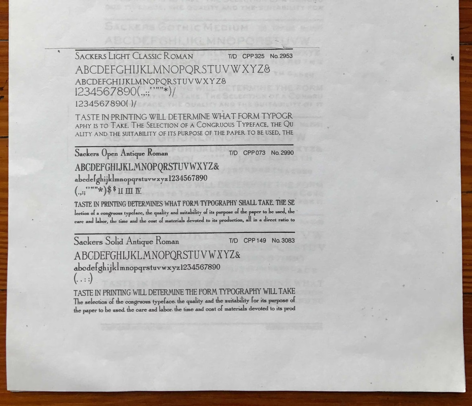
- Sackers Antique Roman (3 styles)
- Sackers Gothic (3 weights)
- Sackers Square Gothic
- Sackers Classic Roman (Sackers Light Classic Roman?)
- Sackers Roman (2 weights)
These typefaces, alternatively named ATSackers, were created in the 1970’s by the stationery engraver Garrett “Gary” Sackers.”
Sackers Italian Script and Gothic have been used to brand Nancy Sharon Collins, Stationer LLC since we opened our doors officially in 1997. The background image is a photo-etched copper plate we used for the original labels on our packaging. It appears backwards (wrong reading in printing terms) so it will “read” in the correct fashion when printed. Notice that Sackers Gothic is one of the engravers fonts with no lower case characters.